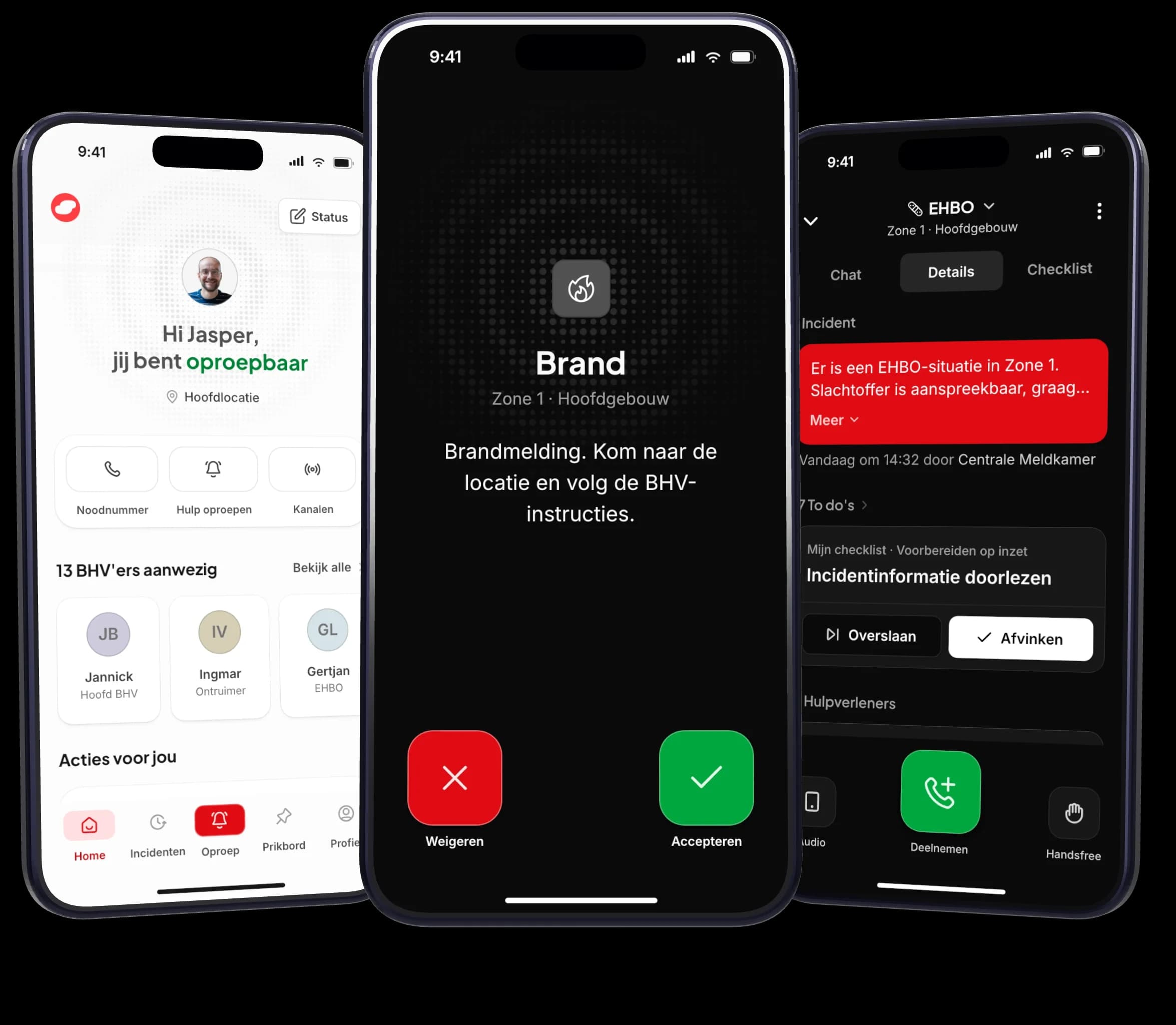
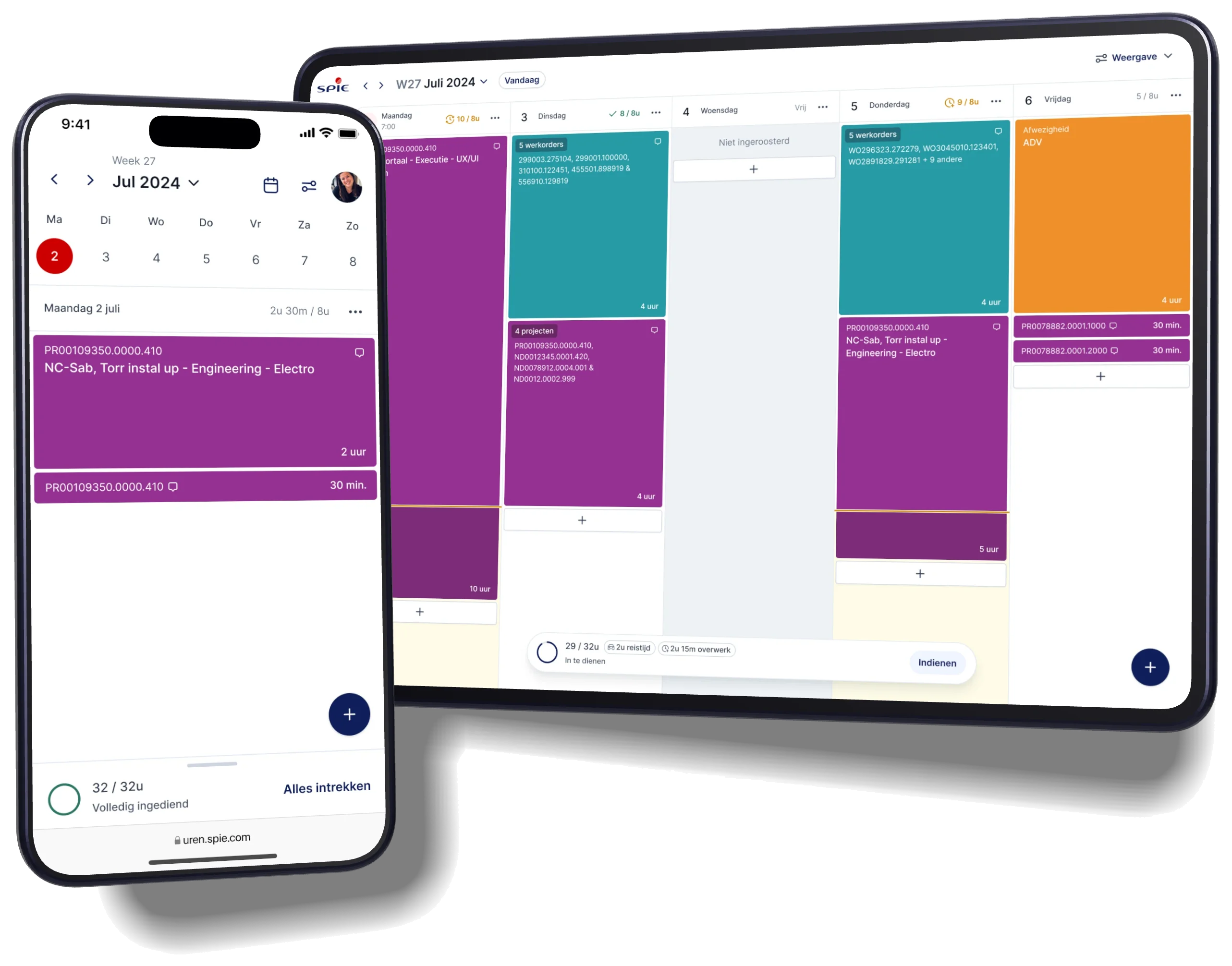
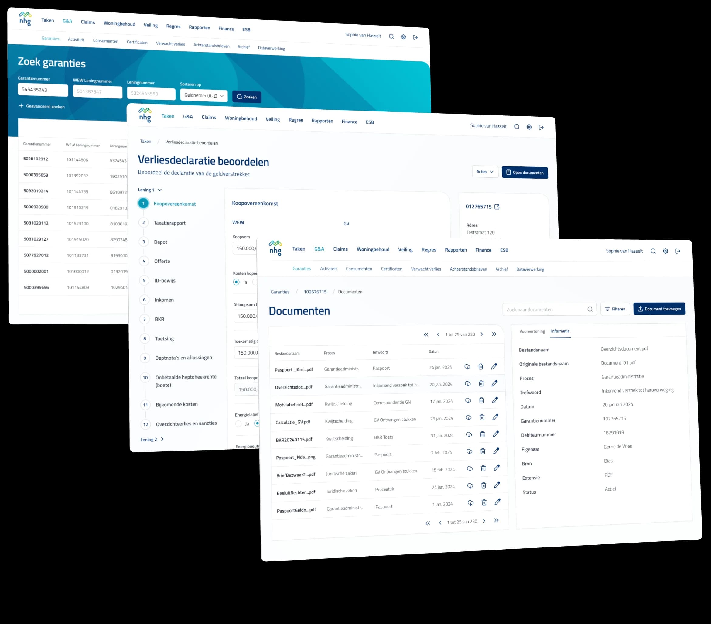
A design system makes your product consistent and efficient to build on: components, tokens and documentation that improve the experience and carry your brand.
As products scale, inconsistency creeps in. Buttons multiply, spacing drifts and every new feature costs more than the last. We build design systems (component libraries, design tokens and documentation) that turn those decisions into defaults. You end up with a system that unmistakably carries your brand, where a new screen starts from parts that are already right instead of from a blank canvas.
Typically 20–40 days for a first release
Audit
We inventory every button, input and spacing value in the product as it is today, and find the patterns underneath.
Translate the brand
Your brand translated into tokens: color, type, spacing, radius, motion. Components are built on those, so the system feels like your product rather than a template, and a change in one place lands everywhere.
Build
A Figma library and, where relevant, the coded components, kept in sync rather than drifting apart.
Document
What a component looks like, and when to use it and when not to. That second part is what makes a system stick.
Both, ideally. A library only designers use drifts from production within months.
Sometimes. If the foundations hold, we build on them. If they are what causes the inconsistency, starting over is often faster. The audit tells us which it is.
Often your own team takes it from there. We write down the decision rules for that, so the system does not depend on us. Or we stay on to maintain, refine and extend the design system and the flows built on it.