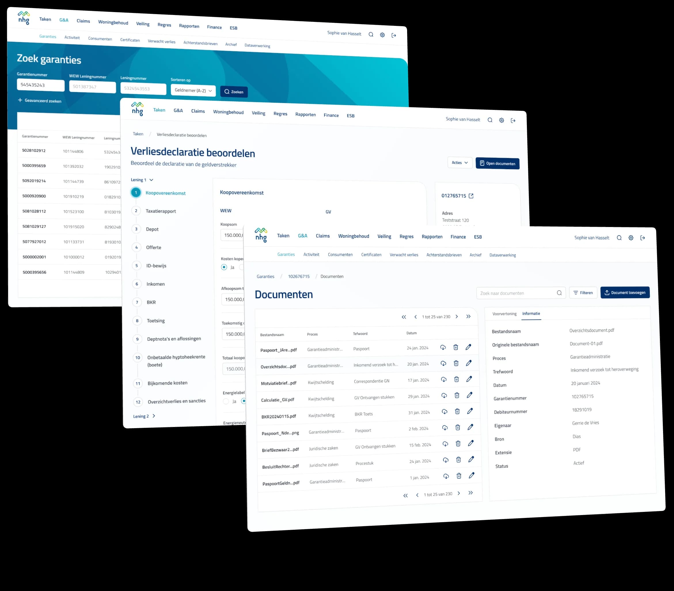
NHG's operations team worked across four separate Mendix apps, each with its own menu and its own habits. We brought them together in one back-office, on a navigation the team helped build themselves and a design system that understands Mendix.
The challenge
NHG, the Dutch national mortgage guarantee, is the safety net for homeowners who can no longer pay their mortgage after a major life event: a divorce, losing a job, the death of a partner. Behind that safety net is an operations team that administers guarantees, tracks arrears and assesses loss claims from lenders.
That work happened in four back-office apps, built in Mendix: Workflow, Guarantee administration, Management and Claims. Each app had its own menu, so two menu bars were permanently on screen, one to switch between apps and one to move within an app. Buttons sat at the bottom of one page and halfway down the next. There was no shared design language for a developer to fall back on.
NHG decided to merge the four apps. That was the moment to redesign the experience as well, and they asked us to do it.
A guarantee file passes through several processes and several colleagues. Before we designed anything, we wanted to know what that work looks like day to day. We interviewed six people from the team about their tasks, where they got stuck and what they worked around in the current apps.
We spent one day a week at NHG's office. That way a question could be asked the moment it came up, and the team could watch the design take shape rather than only see it at the end.
The biggest question was navigation. Four apps with a menu each add up to dozens of functions, from searching guarantees to checking arrears letters, and they all had to fit one structure the team could read without thinking.
So we wrote every function on a card and asked three colleagues to group them, setting the current layout aside, and to name each group. They thought aloud, so we heard which cards were hard and why. A card sort shows how users have organized the work in their own minds, something a conversation alone rarely makes clear. Three sessions produced a structure organized by process, with guarantees never more than one click away.
Workflow
Garantieadministratie
Beheer
Claims
Four apps, each with its own menu bar
NHG App
- Taken
- Rapporten
- Garantieadministratie
- Claims
- Woningbehoud
- Veiling
- Klantreis
- Finance
- ESB
Instellingen
One validated menu bar with nine logical sections
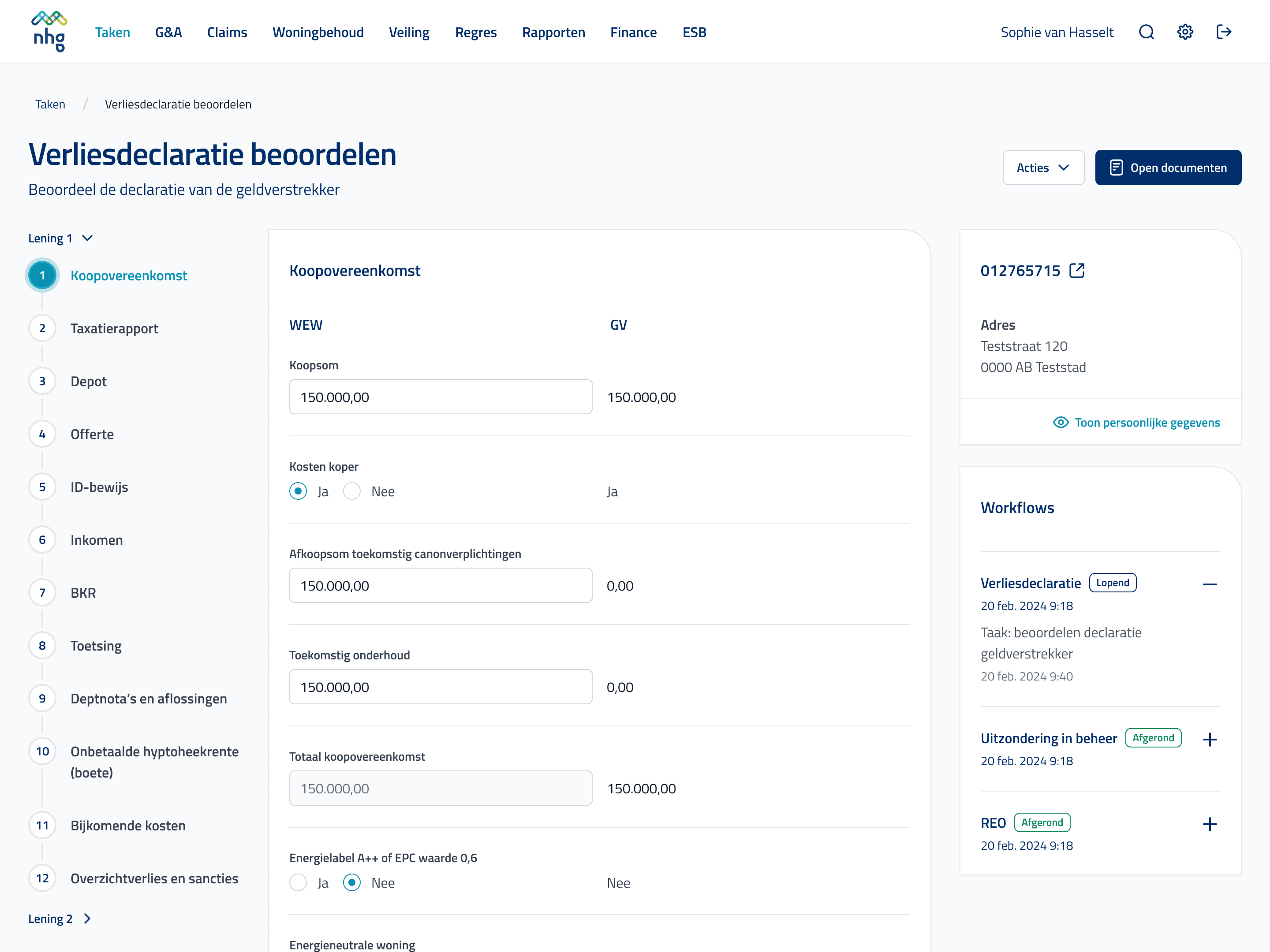
Mendix, the low-code platform NHG builds on, ships its own building blocks. A design that ignores them looks fine in Figma and then takes weeks to rebuild. So we set up the design system from the foundation up: colors, typography and icons, then components such as buttons, tables and forms, then page templates that fix where actions go.
We discussed every part with NHG's Mendix team before it was final. Icons became an icon font instead of separate files because that is faster in Mendix, and the templates match the widgets the platform already knows. The result is a system in NHG's brand that developers can build without reinventing every page.
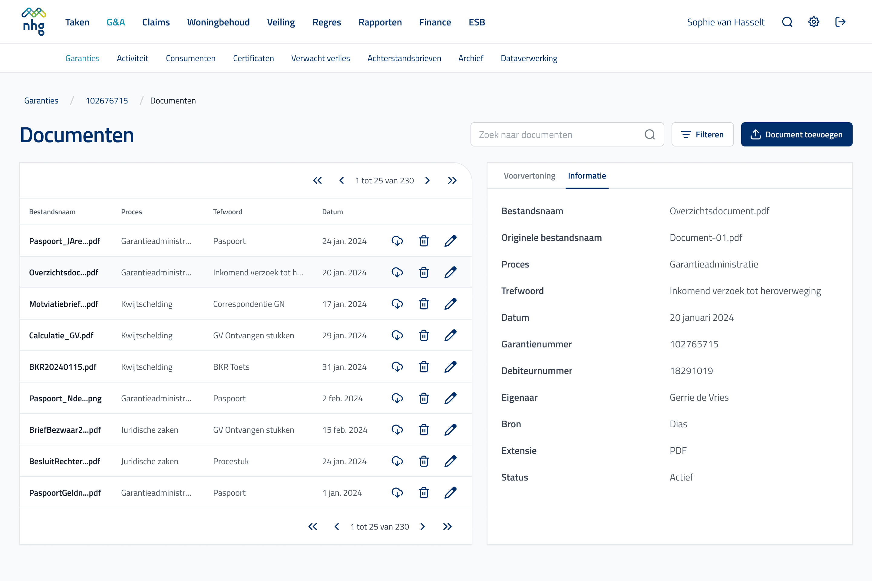
Designed for case work
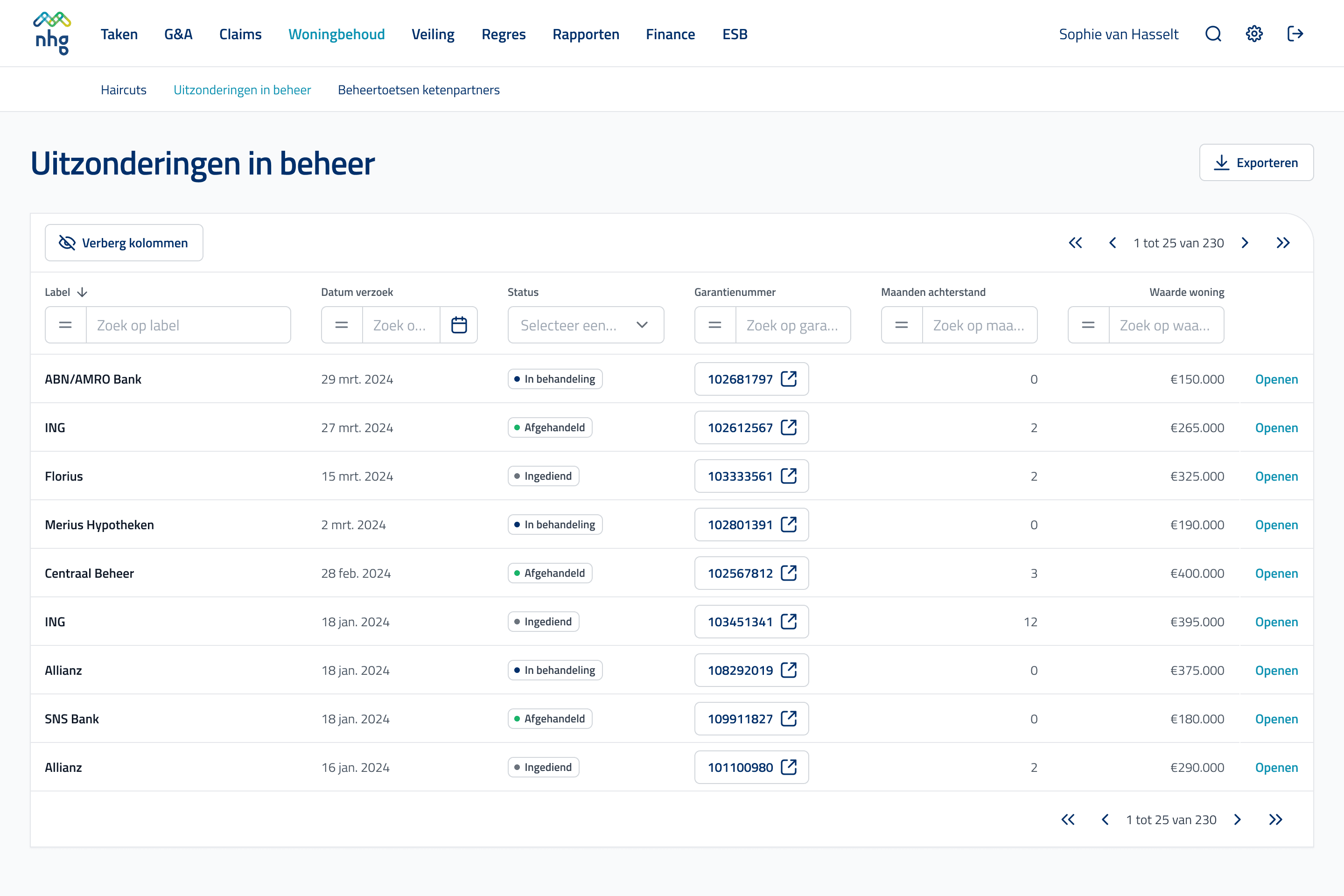
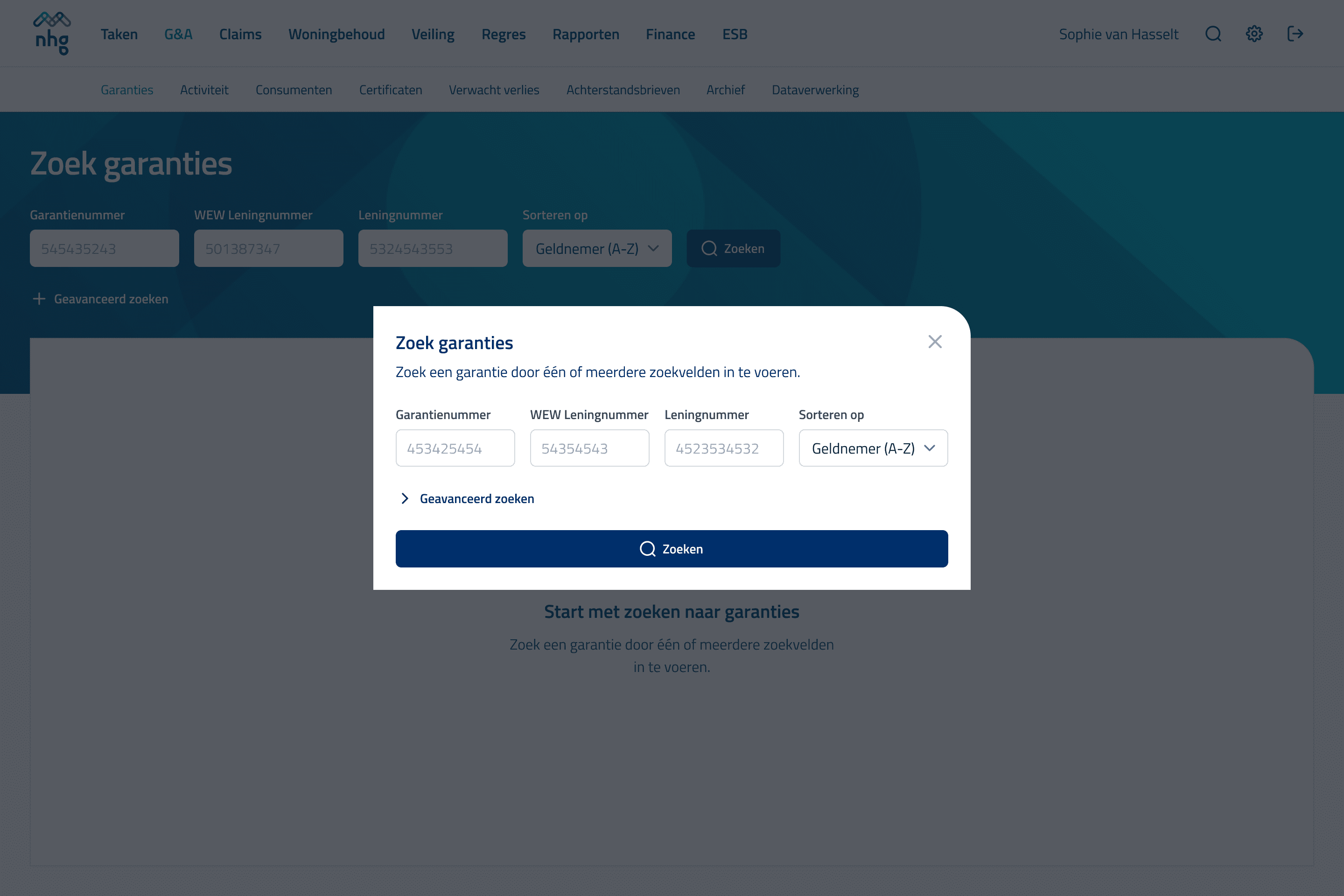
Overviews you set up yourself
Every list filters per column and lets you hide columns, so an overview of hundreds of files becomes yours in seconds.
“[The team's] design work will make several previously frustrating tasks much faster and easier. The collaboration has been smooth, with clear communication and a low-barrier, hands-on approach. Their ability to explain and involve end users has really stood out and made the transition feel seamless.”
Gerrie de Vries
Business Analyst, NHG
The impact
By designing the navigation with the team and tuning the design system to Mendix, operations got a back-office where a file has one place and an action is always where you expect it.
We measured the effect with a User Experience Questionnaire, completed by the whole team before and after the redesign. Work is faster and clearer, and the team is more motivated to use the application.
19%
Faster work
The team rates its tasks 19% more efficient, about 35 hours per user per year.
7–15%
Fewer errors
Clarity went up 7%, which translates into 7 to 15% fewer errors.
+7%
Motivation
The team is keener to use the application than before the redesign.
+13%
Satisfaction
Overall satisfaction with the application rose by 13%.