Safeguard alerts, connects and tracks a company's emergency responders when something goes wrong. Its platform had grown faster than its interface. In three months we did the research, built a design system in Figma and code, redesigned the dashboard and the app, and handed over an iOS app so it could be tested as realistically as possible.
The challenge
Safeguard makes the platform Dutch and Belgian companies use to organize their emergency response: an app that alerts the responders on site, a dashboard for the coordinator, push-to-talk to keep talking during an incident, and buttons, QR codes and fire-panel links to raise the alarm. It is used in offices, factories and care homes, at the moment something goes wrong.
The company was growing up: from a group of friends building a product to a team of twenty-two with ambitions in Germany and in healthcare. The product had not kept pace. Its look had aged, and features that took months to build went unnoticed by customers.
Safeguard asked us for the research and the foundation: a design system the team can build on, and the most important flows redesigned.
We started with a morning in Breda with the founders and the product lead, mapping the product vision: who Safeguard is for, what they need in the first minute of an incident and where the business wants to be in five years. That same morning we collected everything sales and customer support knew about the end user, so our interview questions had something solid to build on.
Then we interviewed five emergency response coordinators, half of them on site: a factory with shift work, an airport, a multi-tenant office, a care organization, a municipality. Each interview took an hour, one on one, about what actually happens when someone collapses or smoke is spotted. We laid the patterns next to Safeguard's own customer satisfaction survey to see which signals were structural and which were one-offs.
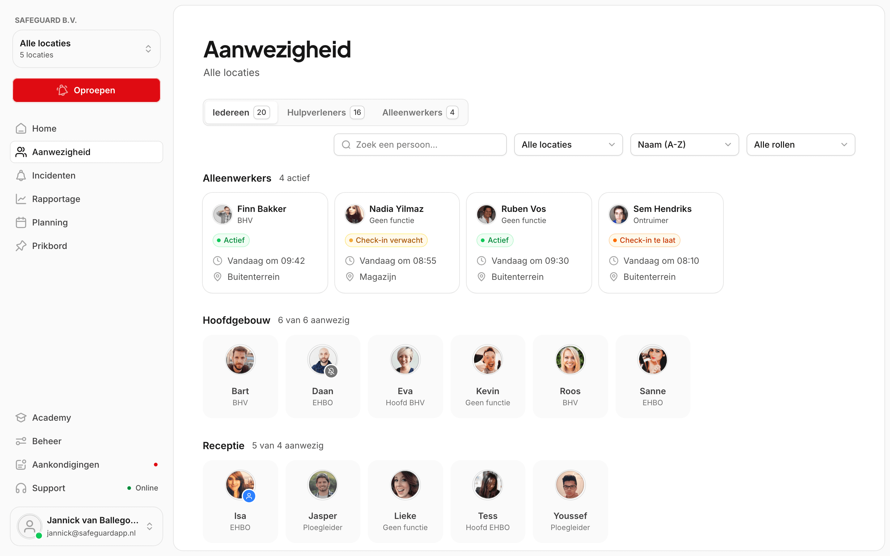
The most useful finding was uncomfortable: the product is designed around an employee who reports an incident in the app, but in practice people call reception or shout. What coordinators worry about most is whether the attendance the dashboard shows is real.
Safeguard's developers already had a component library and Tailwind styles, and their own words for it were "too flexible". So we built the design system from the foundation up: colors, typography and icons, then the components, then the page templates that fix where things go. The look is black and white with red only where it means something, filled icons that echo the curve of the logo, slightly smoothed corners, and shadows on cards but never on buttons, because an emergency tool should feel flat and certain.
The system lives in two places on purpose: in Figma, so designers can design in it, and in code, as a component library with Storybook as the single source of truth for how a component looks and behaves. We wrote a workflow guide that takes a designer from a clean laptop to a merged pull request, so the team could work in it from day one.
How the system flows: the Figma design system feeds both the Figma design files and the coded Storybook, and the prototype is built from Storybook.
The coordinator's dashboard
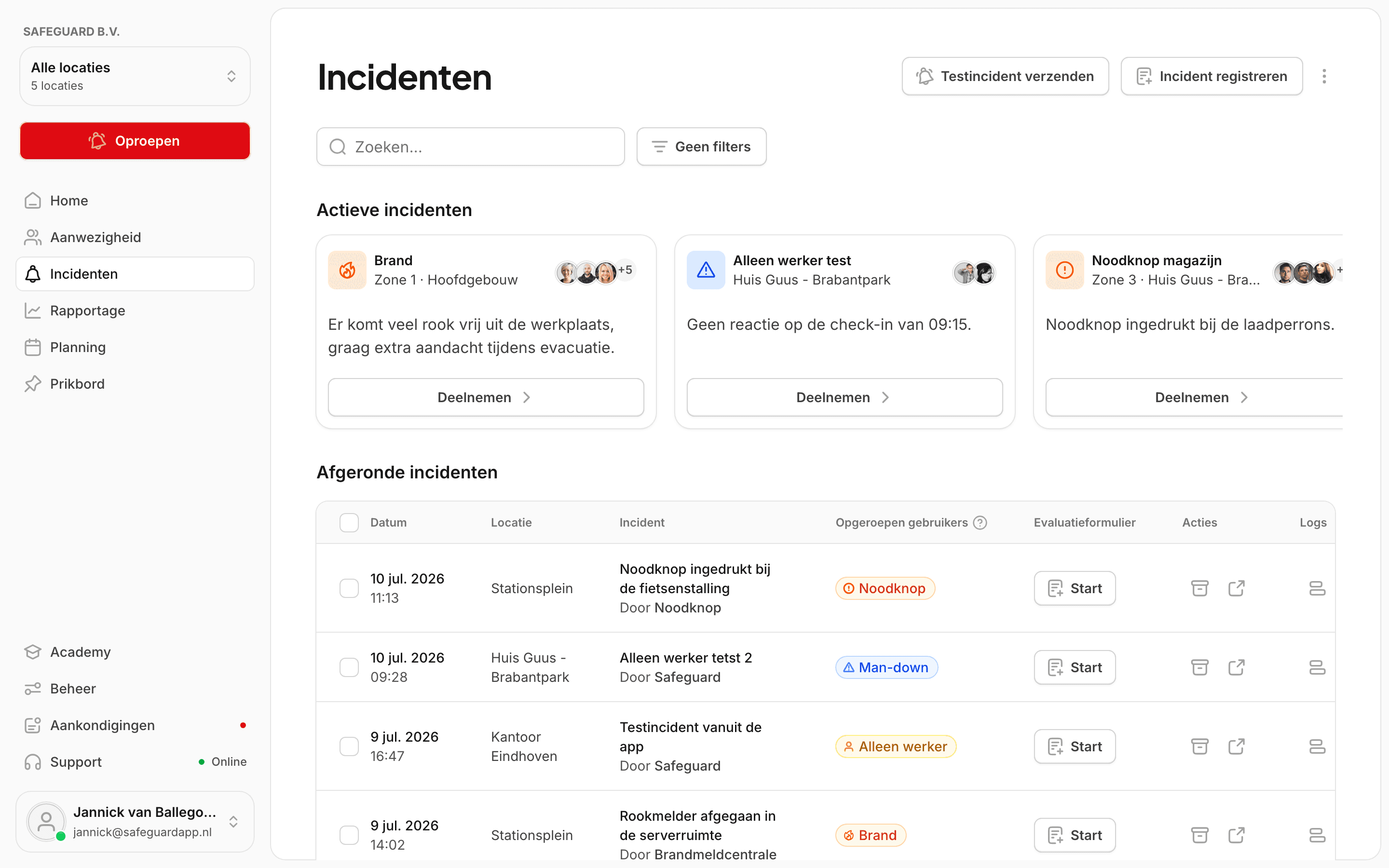
Incidents, active first
Whatever is happening now sits on top, with who is on it and a way in. What is over becomes a row to evaluate, so reporting stops being a separate chore.
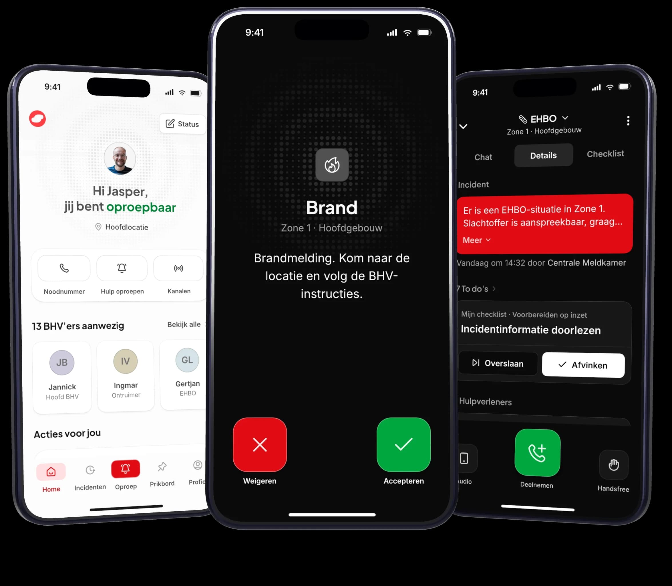
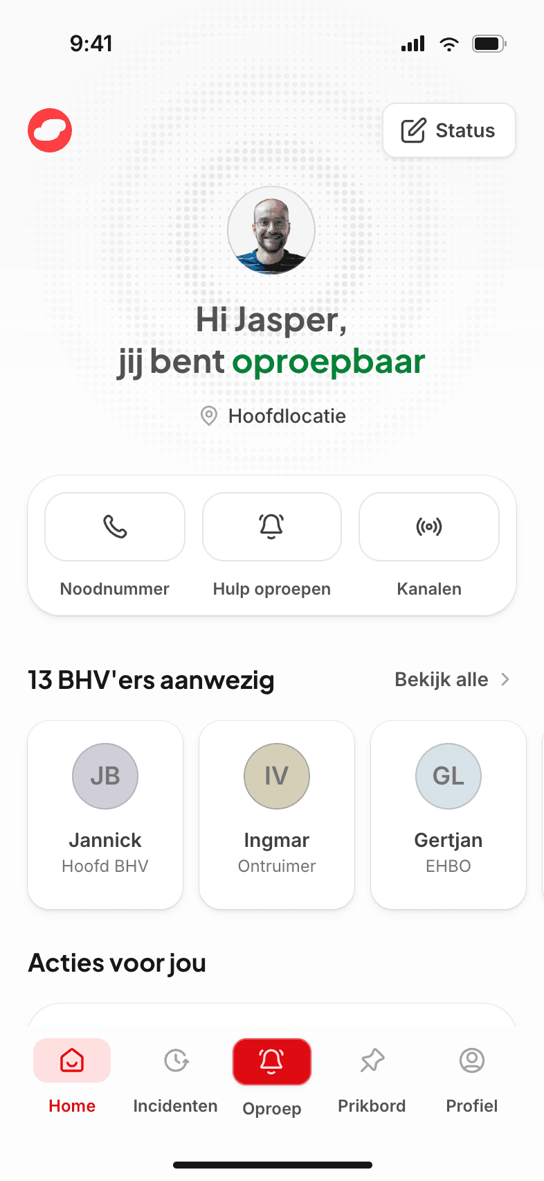
The app is what a responder holds when the adrenaline hits, in a corridor that has just gone loud. So every flow was designed for that state. The home screen answers one question first (are you on call?) and puts emergency number, alert and channels within thumb's reach. Raising an alert is choosing a scenario and going.
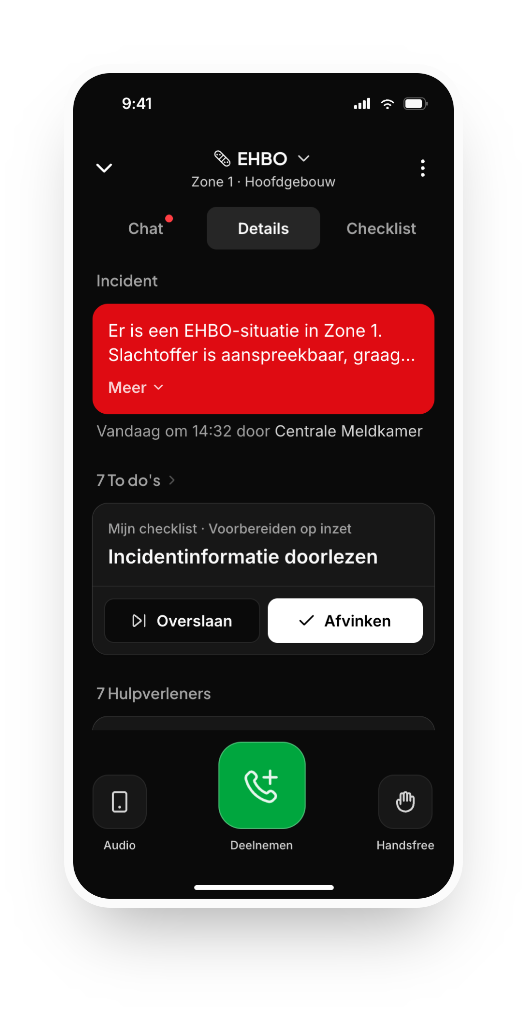
An incoming alert fills the screen and asks for one answer. An active incident lives in a persistent card above the navigation, so you stay connected to the incident and its push-to-talk channel at all times.
We built the prototype in code rather than in Figma: every state is a setting in the URL, so a stakeholder could open a link and see exactly the case we meant.
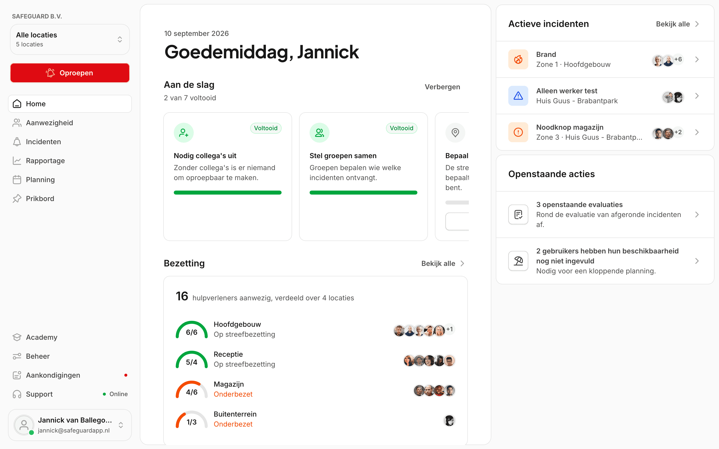
- A quiet day is about certainty: showing you're on call, that your settings are right so no false presence can creep in and which actions are still waiting for you.
- Reporting starts with one question: what's going on? You pick the scenario that fits, and the right people are called.
- An incoming alert strips away every distraction so you focus entirely on the emergency: what, where and one choice: are you coming or not?
- The incident screen itself: who's coming, the checklist and push-to-talk. It is deliberately larger, for the moments your phone is further away.
- A running incident stays as a fixed card above the navigation: wherever you are in the app, you're one tap from it, push-to-talk under your thumb.
A prototype in a browser convinces a boardroom. It does not tell you whether a responder finds the alert button with a wet thumb on the stairs. So we ported the prototype to a native SwiftUI app: no third-party dependencies, the same screens and the same scenarios. The colors and the scenario data are generated from the web prototype's source, so the two cannot drift apart.
We handed over everything: six Figma files, two repositories, the Storybook, the workflow guide and the iOS project ready for the team to publish their own builds. The design system now grows with the team's next cycles, a lone-worker module and the academy, with us a message away.
From day one, the brief was a foundation the team could keep building on without us. The measure of it is what they shipped after we left.
The impact
Safeguard got what it asked for: research it can quote, a design system in Figma and code that a designer and a developer read the same way and the most important flows of the dashboard and the app redesigned and proven on real devices.
The team is building on it now. The numbers below are ours, the ones we can stand behind without asking; the results in the product are theirs to share.
5
Interviews
Coordinators from five sectors, laid next to the customer satisfaction survey to separate patterns from one-offs.
40 days
From research to foundation
We started with research and product context and worked toward a design system the team keeps building on.
12
Core flows
The responder app and the coordinator's dashboard, from alerting and presence to the active incident, redesigned as one system.